Struggling to get your website to drive solid conversions for your business?
I’ve got a solution that can help you generate more leads and get better results.
It’s a simple six-page website that has helped my agency nearly double our list and land more clients since we implemented it.
It works really well for agencies, those selling high ticket programs, courses, coaching, the works.
I’m going to break down the pages for you, what to include and what not to include so you can start generating leads, nurturing them, and getting them on the phone.
Table of Contents
What’s The Goal?
One of the biggest mistakes I made when starting my business that I wish I had done sooner is building a list.
I had a simple one-page website where if you wanted to click and book a call you could but I didn’t have any content.
We weren’t capturing leads until four years into the business (cue sad trombone sound).
Now I’m happy to say we are consistently getting new leads from our website on a daily basis using OptinMonster.
The things that have helped us do that is a revamp of our website (the one I’m going to show you right now), putting out consistent content on our blog + capturing leads by giving away valuable stuff on our site.
In the case of my agency and most of my clients, the goal is focused around selling high ticket programs and services which entails generating leads, nurturing those leads, and then getting those people on the phone.
But keep in mind that these concepts can be used no matter the funnel.
Without further ado, let’s get into the pages you need.
#1 The Home Page
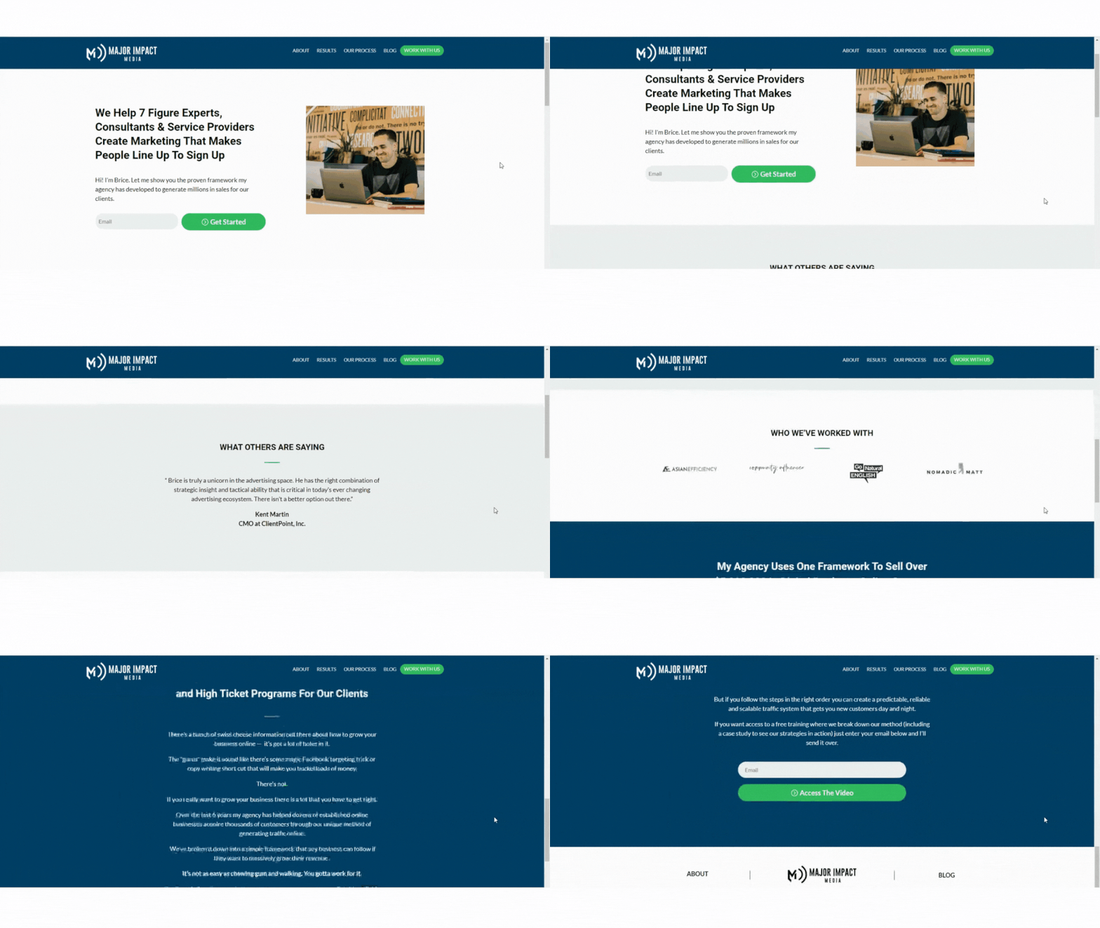
A big chunk of your visitors will land on your home page first – so this is your chance to make a first impression.
You have just a few seconds to grab their attention, tell them exactly what you do, and get them excited about working with you.
If you don’t make it clear to your visitors right away how you can help them, they will bounce off your site and on to another.
Here’s a few suggestions on how to keep your visitors on the home page:
- Make sure your headline is short, clear, unambiguous and to the point. You can change this as your messaging changes and even test out different headlines to see what works best.
- Include customer testimonials as social proof of the value you offer.
- Add a lead capture that adds value for your audience and shows a bit more about what you do. It’s hugely important to grab people’s emails right away on the home page.
#2 The About Page
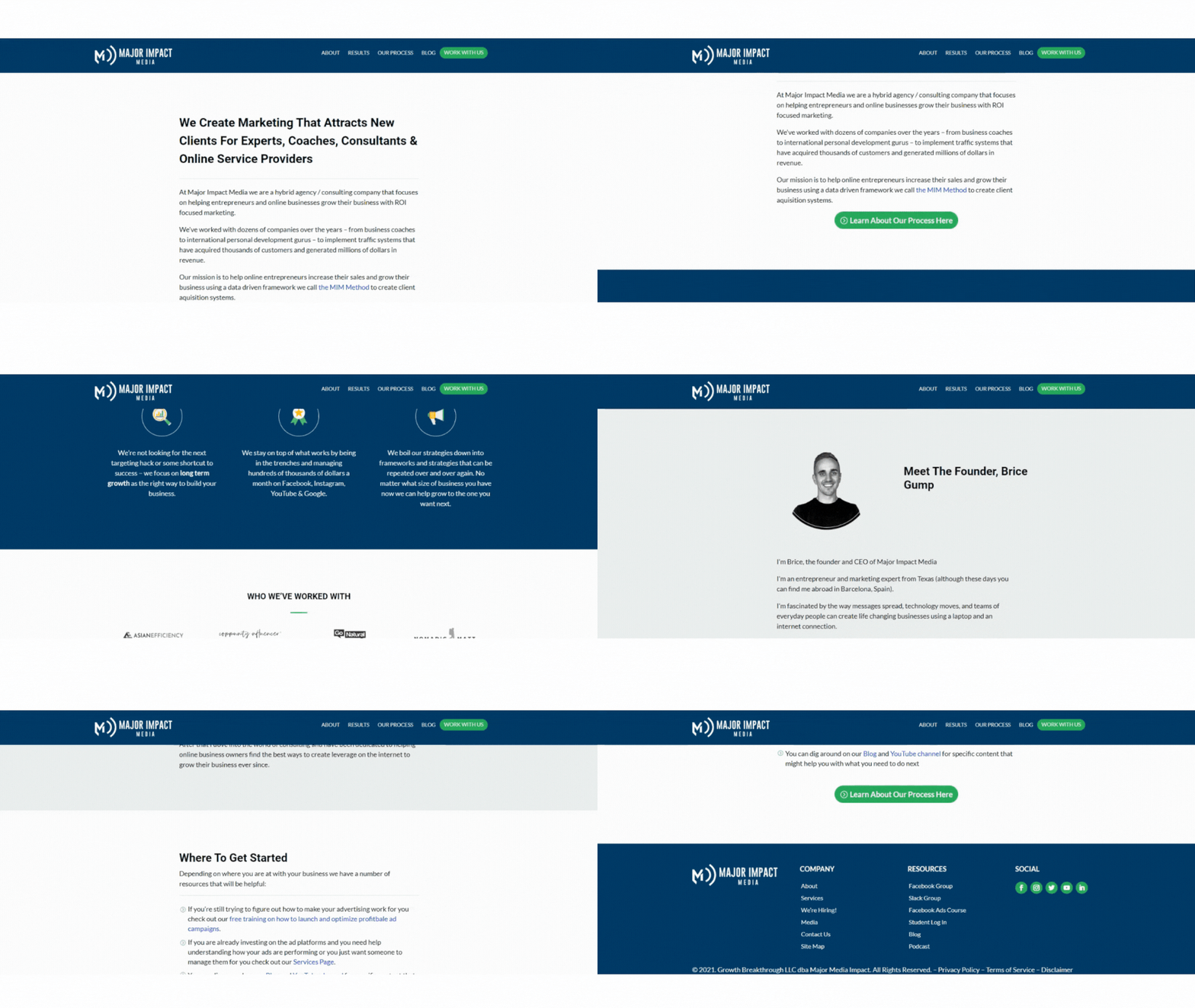
The about page is your chance to let your visitors know more about you and your company but there’s something fundamental that most people miss here.
The about page really shouldn’t be all about you.
It should still focus on what you can do for your customer and the process, framework, and results you can generate for people.
You can definitely have a little snippet about you and your team where you introduce everybody, it’s great to have that personality.
But often people write their about page focusing solely on them – you want to flip that and focus about what you can do for your customers.
#3 The Results & Testimonials Page
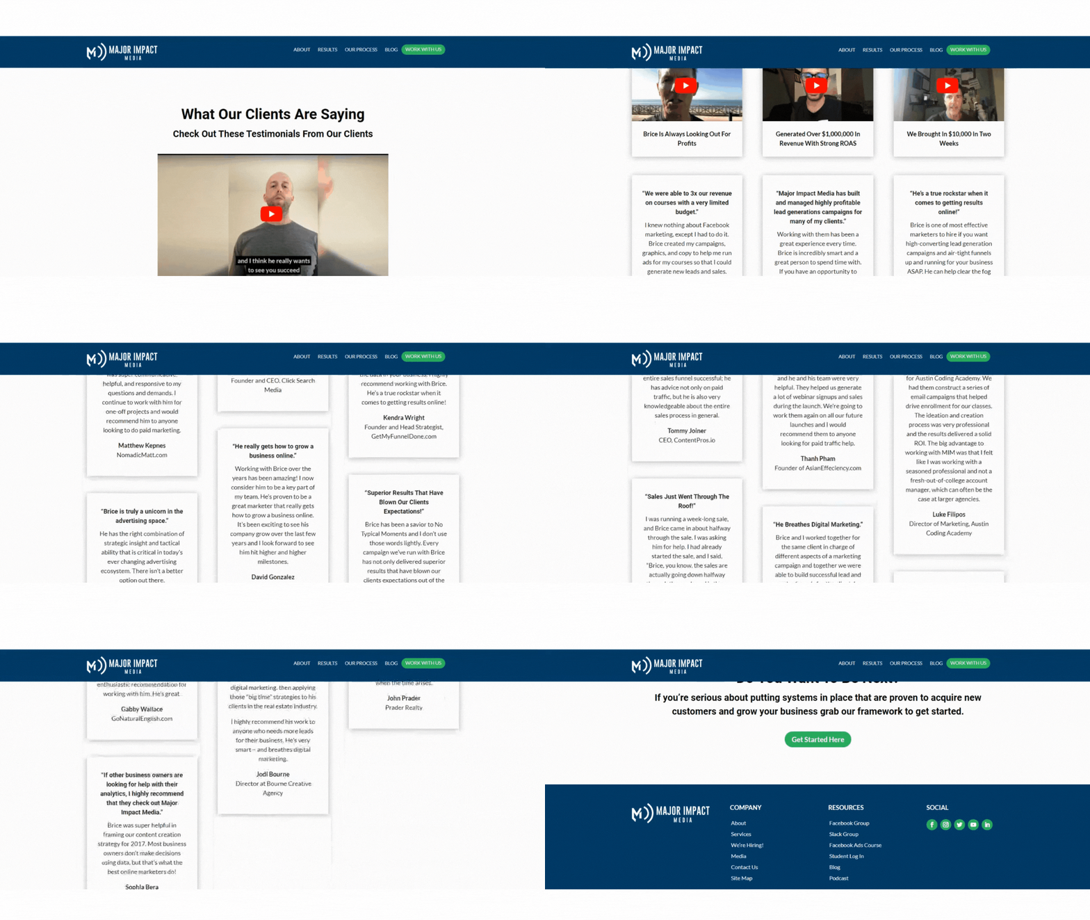
Showing demonstrable results (creating social proof) on your site is super powerful for helping to build trust online and encouraging visitors to take action.
You can vary the page with video or written testimonials that speak directly from previous clients about proof that your process, framework, and services work.
#4 The Process / Framework Page
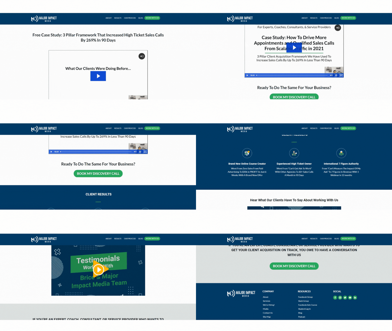
This is the most important page for your audience to take action.
It’s your opportunity to give people a demo of what you do differently and how you can help them through some kind of lead capture or opt-in.
You can create a super short 15 – 20 min video that people can opt-in and watch that walks them through exactly what your framework or process is and exactly what you do.
Note that you can sprinkle testimonials and client results on all of these pages for more of that social proof special sauce.
#5 The Work With Us Page
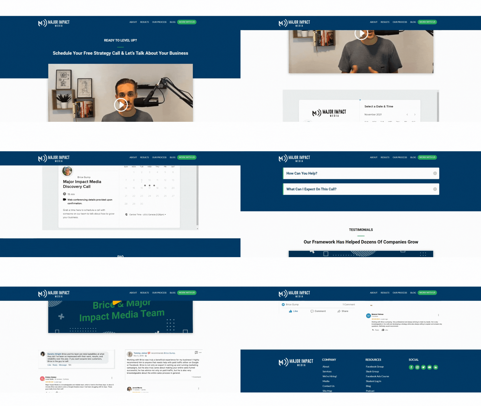
If anyone at any point wants to follow through with working with you, they can click on the “work with us” button.
You can add a super short video on the page that shows people (again) what you can do for them and lets them take action to book a call right then and there.
#6 The Blog
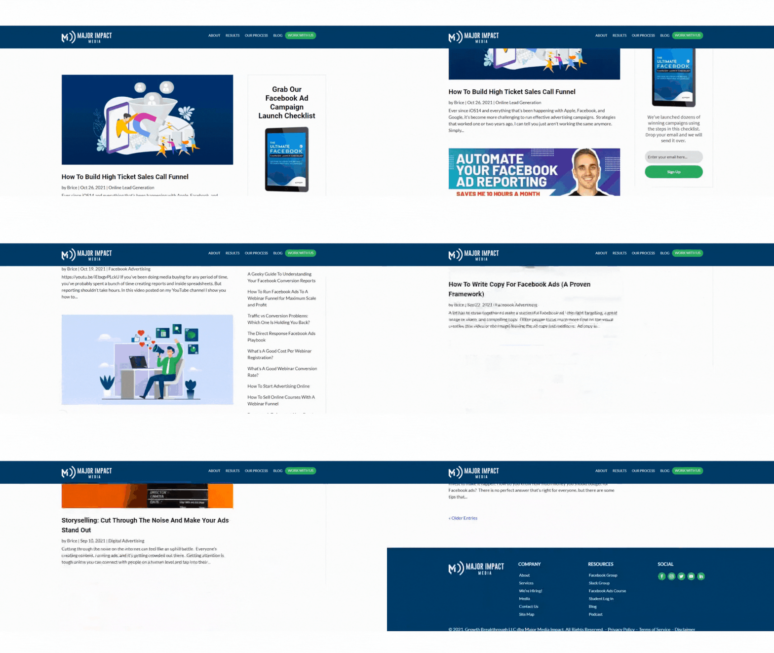
Lastly you have the blog where you’re posting lots of valuable content for your audience.
If you’re selling high ticket programs and services, put a lot of focus around case studies and authority pieces.
At my agency the number one traffic article on our website that’s landed us five-figure contracts is one of our case studies.
They’re super specific and not very high volume, but when someone is searching for a particular type of business and a particular type of offer, our case studies often show up.
It’s yet another way to show people exactly the kind of results you can get and your process for doing that.
What Shouldn’t Be Included In Your Website
You’ll notice there is not a list of services or pricing on this six-page site.
You want to avoid just listing all that stuff out… it’s boring, overwhelming, and unnecessarily creates too many choices for your visitor.
You want the choice to be clear… if you’re this type of person and you want this result, take this action. Here’s how we’re done it before and proof it works.
That’s it. Easy peasy.
That way you focus on getting your visitors excited about what you can do for them rather than overwhelming them with packages or different pricing options.
Wrap Up
So that’s the website. Seems like a lot of pages compared to the common one-page website but it’s actually so simple.
What you end up with is six pages all focused around the same goal, linking people to the process so they opt-in and hopefully get on the phone with you!
Your visitors will naturally be prequalified after going through your website as they should know enough about your business, how you work, and the results you’ve gotten.
The next step is just jumping on a call, figuring out if it’s the perfect fit, discussing pricing, and creating a timeline to get started!
[optin-monster slug=”pprdzyrrpu195seo1ctg” followrules=”true”]


0 Comments